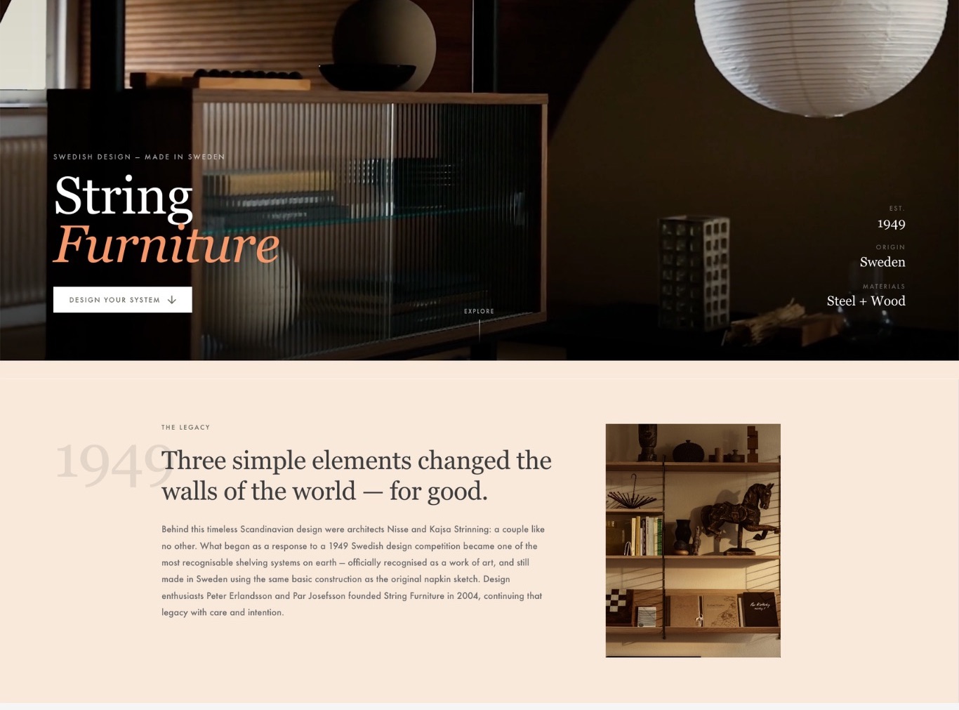
String Furniture
Brand Landing Page
String Furniture is one of the most customizable furniture systems in the world — but that same flexibility made it nearly impossible to sell online through a traditional catalog. With thousands of configuration options and no fixed SKUs, the existing brand page on Lekker’s site was bare bones: a placeholder that confirmed the brand was carried but offered nothing else.
The brief was to transform it into something worthy of the collection — an immersive brand experience that could communicate the breadth and quality of the String system, drive brand recognition, and convert interest into direct inquiries and configurations.
My role
This project required a different kind of thinking than a standard product page build. With no catalog to pull from, the page had to do all of the work that individual PDPs normally would.
Defined the editorial angle — leading with atmosphere and the system’s flexibility rather than individual products, positioning String as a design investment rather than a purchase.
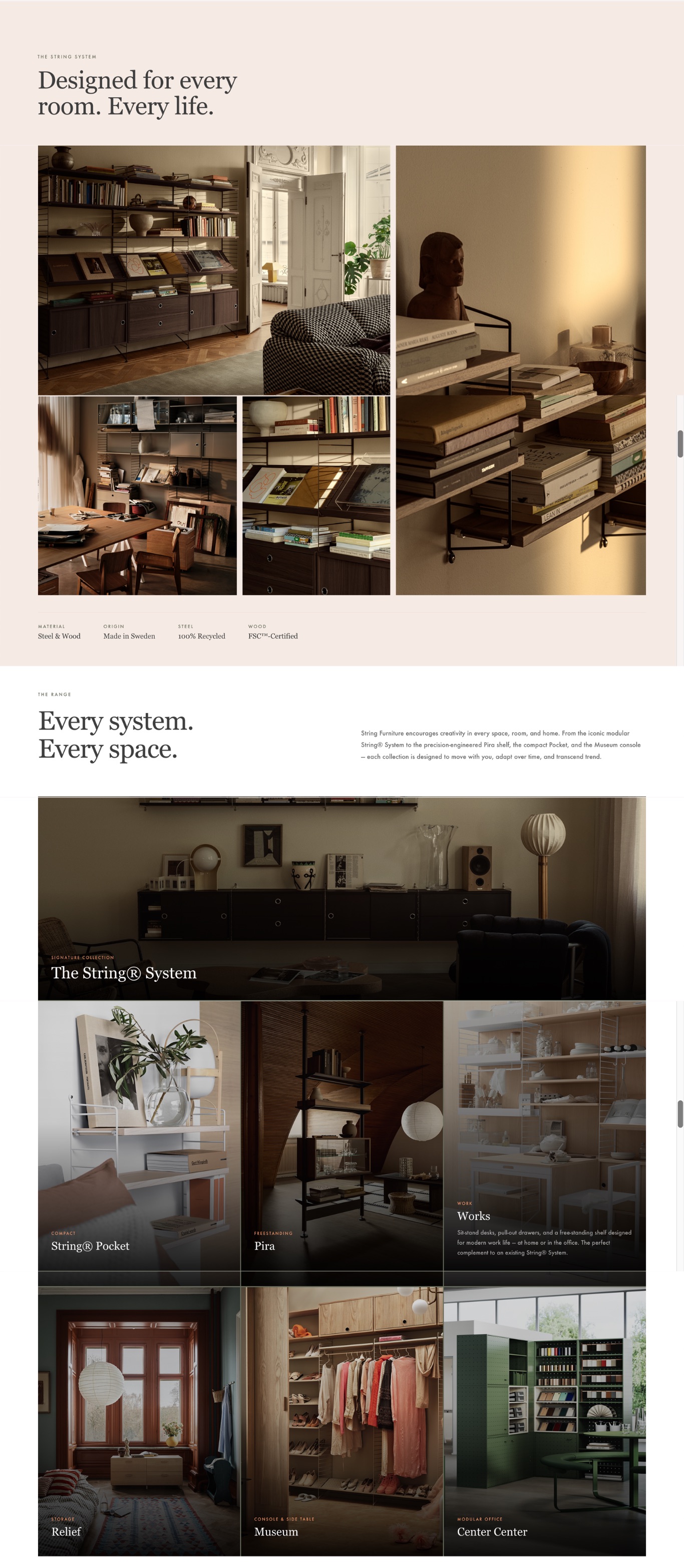
Designed and implemented an immersive landing page in BigCommerce HTML, with lookbook-style imagery, collection overviews, and a narrative structure that guided visitors through the range.
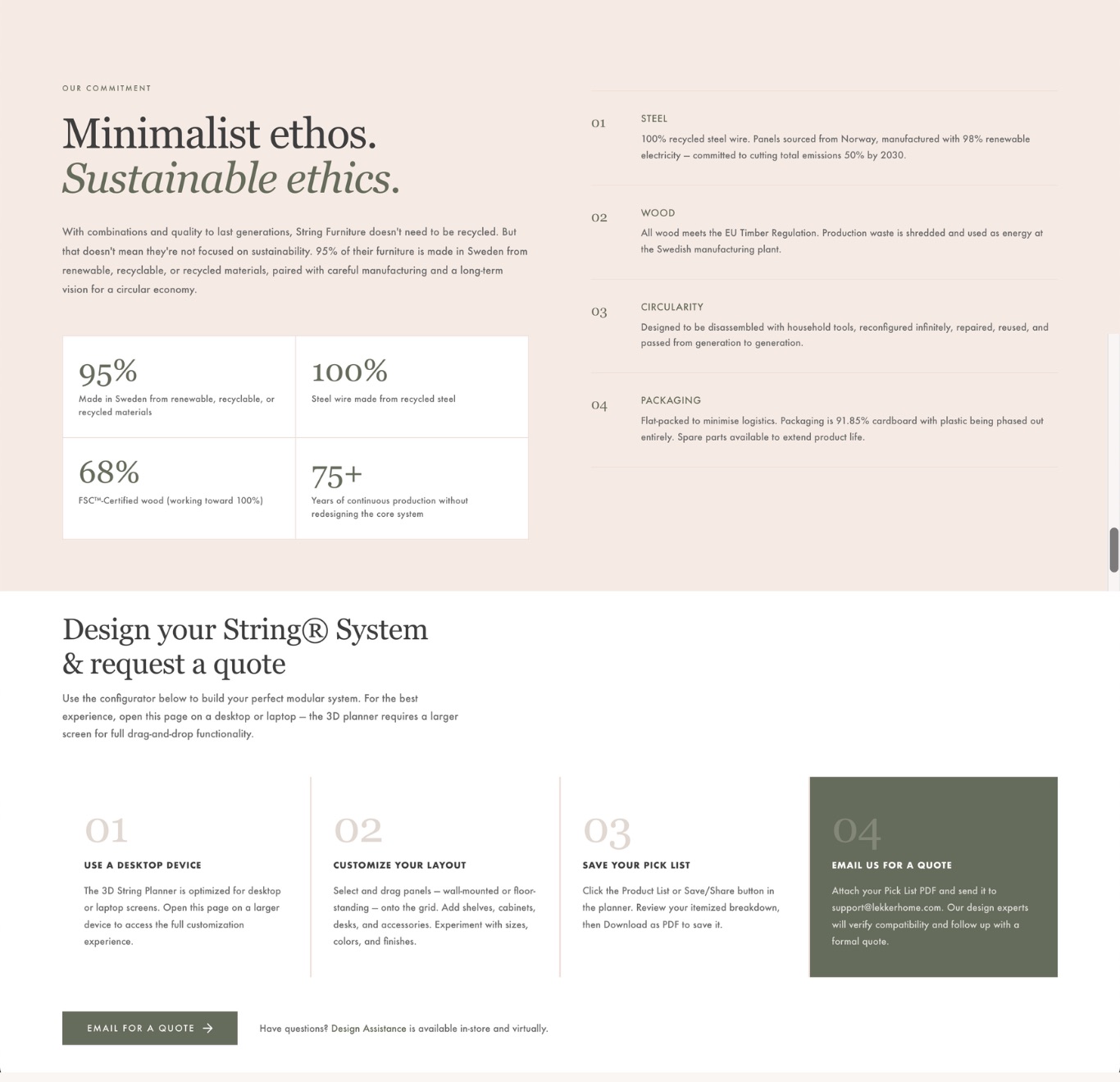
Embedded String’s native configurator tool directly into the page, allowing customers to build their own system and submit configurations as inquiries to the Lekker team.
Wrote all brand and collection copy — capturing String’s design heritage and the tactile appeal of the system without being able to lean on individual product descriptions.
No catalog. No SKUs. No template to follow.
String Furniture’s collection is built on modularity. Customers mix shelving units, cabinets, desks, and panels across dozens of sizes, finishes, and configurations. That flexibility is the product’s greatest strength and its biggest ecommerce challenge.
A brand page already existed, but it was a placeholder: no imagery, no brand story, no way for a customer to understand what String actually offered. The goal was to turn that empty shell into a full editorial experience — one that could sell the system without a single traditional product listing.
A brand page existed, but it was bare bones: no imagery, no editorial context, no information about what String offers. It confirmed the brand was carried and nothing more.
The collection couldn’t be reduced to a standard product grid. Every customer’s ideal String system is different, requiring a different kind of discovery experience.
With no cart or checkout flow, the page had to do enough convincing that customers would reach out directly rather than clicking away.
Traditional conversion metrics didn’t apply. Success meant configurations submitted and inquiries generated from a brand-new page with no traffic baseline.
Design decisions
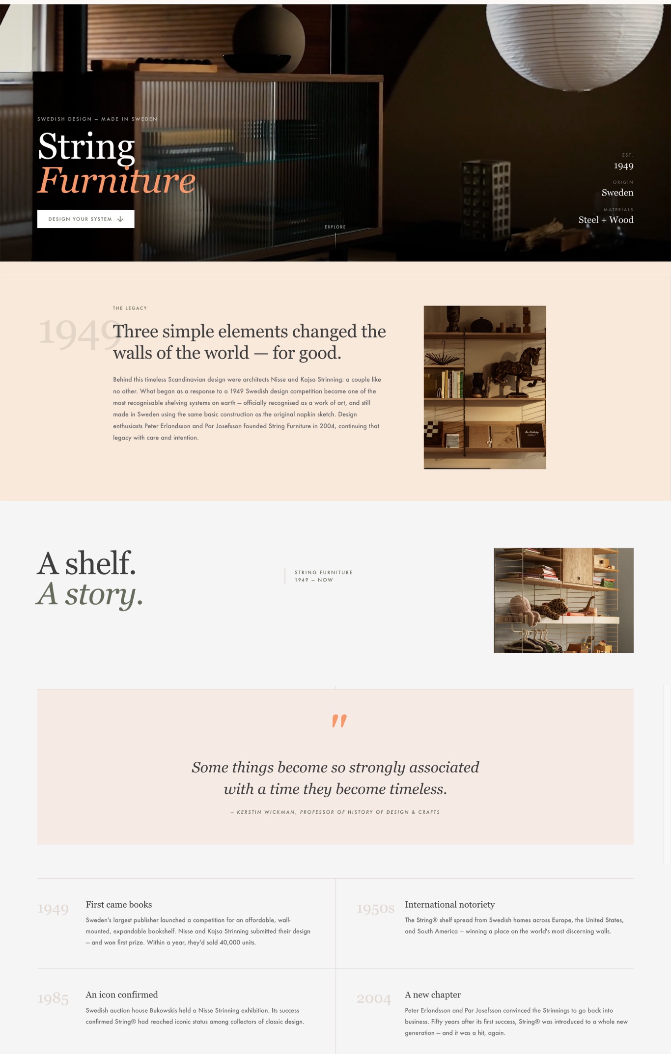
The page was structured to move visitors through three phases: introduction to the brand and its heritage, exploration of the collection’s range through lookbook imagery and collection breakdowns, and finally the embedded configurator where interest could convert into a real inquiry.
The design leaned on String’s own visual language — clean geometry, considered color, Scandinavian restraint — while framing it through Lekker’s editorial voice.
What I learned
This project pushed me to think about ecommerce pages differently. When there’s no catalog, the page itself becomes the product. Every editorial decision, every image selection, every copy choice has to work harder because there’s no product grid to fall back on.
Embedding the configurator was the most interesting creative decision — it transformed the page from a passive brand experience into an active design tool, which made the inquiry path feel natural rather than forced. Customers arrived to browse and left having already designed something.