The Rely Collection
The Rely Chair by Hee Welling for &Tradition is one of the most versatile seating collections on the market. What began as a single dining chair in 2020 has grown into a family of over 100 configurations spanning dining, office, lounge, counter, bar, stacking, and outdoor seating. all built around the same 100% recycled shell and the same quiet Scandinavian character.
Lekker’s sales team was fielding consistent inquiries about the collection, but there was no dedicated page to send customers to. Products were listed individually across multiple categories, with no editorial context, no model comparison, and no sense of the range. The brief was to fix that and build a single immersive destination for the entire Rely collection.
My role
This project required thinking about the collection the way a customer would encounter it for the first time: with no prior knowledge of the model families, no sense of the range, and no obvious way to navigate more than 100 products. The page had to build that context from the ground up.
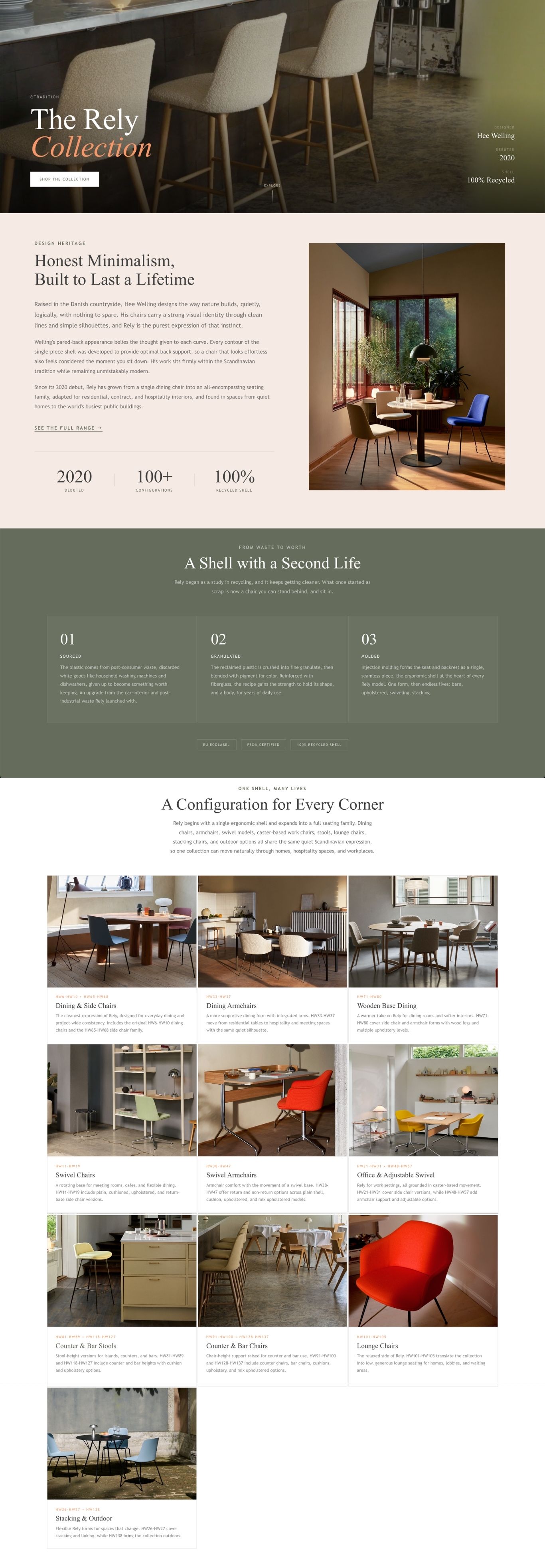
Wrote the brand and collection introduction, covering Hee Welling’s design philosophy, the Rely shell’s recycled material origins sourced from post-consumer white goods, and the collection’s growth from a single dining chair to a full seating family. The story had to earn the customer’s interest before they started browsing.
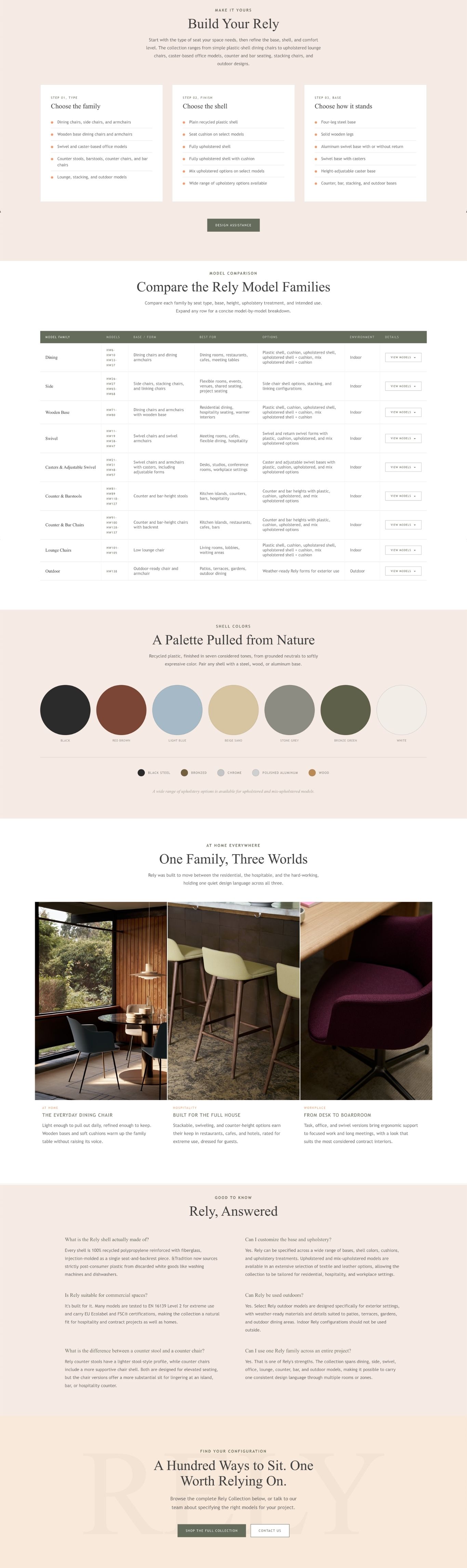
Organized the 100+ models into ten clear families — dining, side, wooden base, swivel, office, counter and bar stools, counter and bar chairs, lounge, stacking, and outdoor — each with a summary of best-use scenarios. A step-by-step configuration section guided customers through type, finish, and base to give them a framework for navigating the options without being overwhelmed.
Built a full model family comparison table covering seat type, base form, best-use environment, upholstery options, and indoor/outdoor designation. The table was designed to serve as the reference a sales associate or trade customer would reach for when specifying across multiple rooms or zones.
Designed and implemented the full page in BigCommerce HTML, using a video hero, editorial sections, the model family grid, comparison table, shell color palette, and a full product grid below. The layout guides customers through the collection’s story before presenting the full range to shop.
100 products, one coherent story
The Rely collection’s breadth is its greatest strength and its biggest communication challenge. A customer looking for a dining chair and a customer specifying office seating for a contract project are both looking at the same collection, but they need very different things from the page.
The page had to serve both without collapsing under the weight of the catalog.
Rely products were listed individually across living room, dining, and office categories, with no way for a customer to understand they were all part of the same collection. The full range was invisible unless you already knew what to search for.
More than 100 individual products needed to feel navigable, not overwhelming. The solution was organizing by family rather than model number and leading with use-case logic so customers could find the right part of the range without wading through everything.
Rely is genuinely at home in a residential dining room, a hospitality setting, and a workplace environment. The page needed to speak to all three without making any one feel like an afterthought. Dedicated context sections handled this better than trying to address everyone in the same copy.
Rely’s 100% recycled shell is a meaningful differentiator, but it needed to be communicated with specificity to land properly. Generic sustainability language wouldn’t do it justice. The copy covered the full sourcing and manufacturing process so customers understood what the claim actually meant.
Design decisions
The page leads with Hee Welling’s design philosophy and the shell’s material story before a single product appears. That order was deliberate. A customer who understands what Rely is and why it’s made the way it is will approach the product grid differently than one who arrives cold.
The three-step configuration section gives customers a mental model for navigating the range before they encounter 100 products. Without it, the grid feels like a catalog. With it, it feels like a system.
What I learned
The most useful thing this project taught me about large collection pages is that structure is a form of editorial work. Deciding how to group 100 products, what order to present information in, and what a customer needs to understand before they start browsing. those decisions shape the experience as much as the copy or design do.
The three-context section was the design decision I’m most satisfied with. Rather than trying to write one paragraph that addressed every possible customer, it gave each audience their own moment on the page without making the rest feel irrelevant.