The Newlyweds Edit
Wedding gift shopping is a specific kind of overwhelm. The registry is full of things they need; what customers wanted to give was something they’d love. Lekker’s sales team heard the question constantly in the showroom: what do you get the couple who has taste?
The brief was to answer that question online. A gift guide that felt as considered as the products it featured — beautiful, quick to browse, and structured to eliminate decision paralysis rather than add to it.
My role
The request came directly from the sales floor: customers shopping for wedding gifts in the showroom were looking for curation and guidance, not another product grid to filter through. The page had to do the work that a knowledgeable sales associate would do in person.
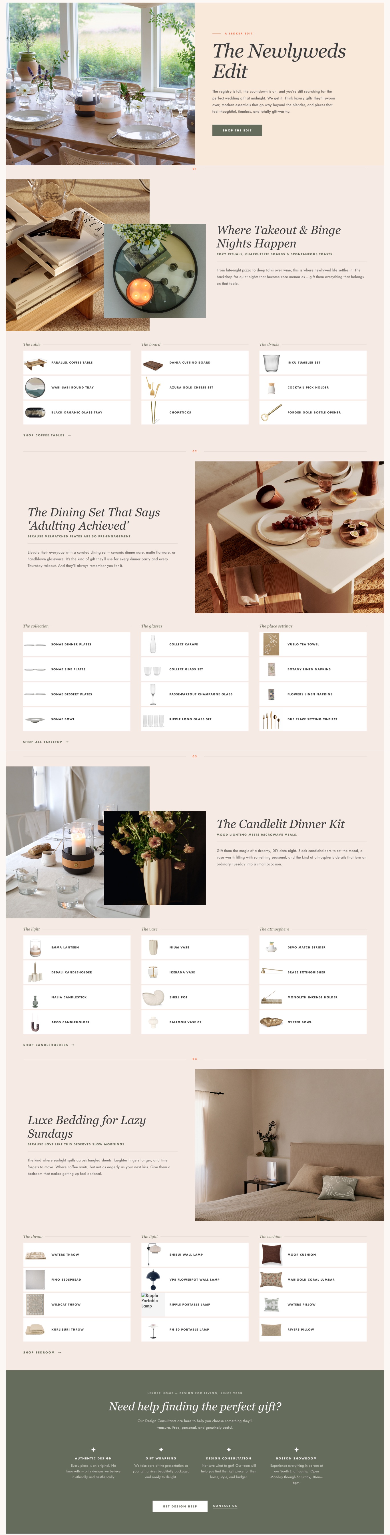
Defined the editorial framework: four gift moments organized around how newlyweds actually live, rather than by product category. Each section became a scene rather than a list.
Selected and grouped products from across Lekker’s catalog into four cohesive stories: cozy nights in, the first real dining set, the candlelit dinner kit, and luxe bedroom accents. Each section was tight enough to guide without overwhelming.
Wrote all section introductions and product grouping headers in a voice that felt personal and warm without being saccharine. The tone matched the audience: people shopping for someone they love, with good taste and a real budget.
Designed and built the page in BigCommerce HTML across two content blocks, using alternating image and product grid layouts to create visual rhythm and keep the page from feeling like a catalog.
Editing for confidence, not comprehensiveness
The core challenge wasn’t finding good products. Lekker’s catalog is full of them. It was resisting the instinct to include everything and trusting that a tight, well-considered selection would land better than a comprehensive one.
Every structural decision on the page came back to the same question: does this make the choice feel easier, or harder?
Organizing by living moment rather than product type (tabletop, lighting, textiles) meant customers could picture the gift in context rather than comparing specs. “The candlelit dinner kit” is a more useful frame than “candleholders and vases.”
Each section was capped at three groupings with three to four products each. Enough variety to suit different budgets and tastes, tight enough that the page never becomes a scroll marathon.
Each section opens with a short, mood-setting paragraph that tells the customer why these products belong together. It’s not product description — it’s permission to feel good about the choice before they’ve clicked anything.
Alternating image-led and product-led layouts created visual interest across four sections without requiring new photography or extensive build time. The page moves quickly because the structure does the work.
How it came together
The page opens with a direct acknowledgment of the gift-shopping experience before sending visitors straight into the four scenes. No lengthy intro, no brand preamble. Customers arrive with a specific task, and the page respects that.
Each of the four sections follows the same rhythm: a headline that sets the scene, a short editorial paragraph, and three tightly curated product groupings with direct links. Consistent, predictable, easy to move through.
What I learned
This project was a useful reminder that good curation is an editorial act. The decision about what to leave out is as consequential as what to include. The instinct to add more, to be more comprehensive, is almost always the wrong one when the goal is to reduce friction.
Starting from a real customer need (a question being asked repeatedly in the showroom) also made every decision easier. The brief was unusually clear: make the choice feel smaller without making the gift feel lesser. That clarity is a gift in itself.
