Furniture Delivery + Preparation Guide
What I built and why
Furniture delivery is the most logistically complex part of buying a sofa or dining table online. Access issues, elevator dimensions, stairwell clearances, building restrictions. Dozens of variables that can turn a successful sale into a rejected delivery and a frustrated customer.
Lekker had no centralized resource to point customers to. Questions were handled ad hoc through customer service, and the information was inconsistent. The brief was to change that: to build something comprehensive, on-brand, and genuinely useful that could live as a reference point across the full purchase journey.
Audited existing customer service questions and delivery-related friction points to identify the full scope of information the guide needed to cover. Organized content into a logical flow that mirrors the customer’s actual journey from purchase to delivery day.
Wrote all guide copy in Lekker’s editorial voice. Clear and direct without feeling clinical, genuinely helpful without making the process feel daunting.
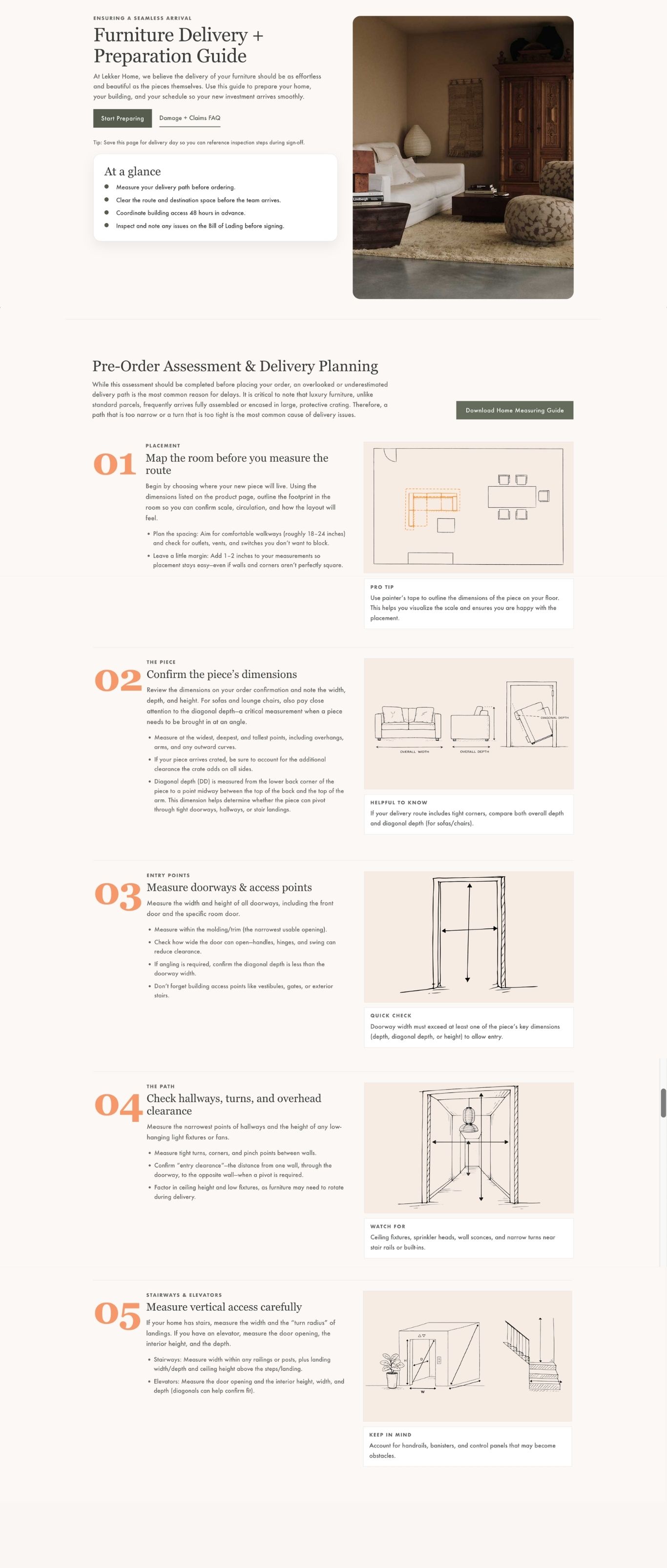
Designed and implemented the page in BigCommerce HTML. Visual hierarchy, section breaks, and typographic pacing were used throughout to make a content-heavy page feel easy to scan and navigate.
Making dense information feel simple
A delivery guide has one job: to make a complicated process feel manageable. That required a different set of design decisions than an editorial landing page. Where editorial work leads with atmosphere, this one had to lead with clarity and confidence.
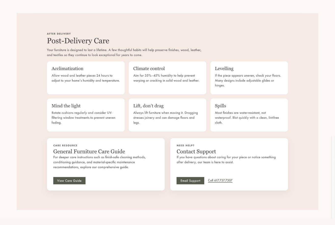
Rather than grouping by topic, the guide follows the customer’s actual timeline. Pre-purchase considerations come before delivery day, which comes before what to do if something goes wrong. The structure mirrors how someone would actually use it.
Headers, subheads, and short paragraphs were used deliberately so a customer in a hurry can find what they need without reading everything. Most people arrive at a guide with a specific question, not a general interest.
Delivery logistics can feel stressful. The copy was written to feel like a knowledgeable friend walking you through it. Specific and practical, reassuring without being dismissive of the things that genuinely require attention.
Design decisions
The page was structured to feel like a considered editorial piece rather than a FAQ dump. Section headers give the page visual rhythm, and the content within each section is tight enough that nothing overstays its welcome.
The design stayed deliberately within Lekker’s brand system. A guide that felt disconnected from the site would have undermined the confidence it was trying to build.
What I learned
This project reinforced something I’ve come to believe about content design: the pages that look the simplest to make are often the hardest to get right. Anyone can list the steps of a furniture delivery. Making that information feel trustworthy, easy to act on, and consistent with a brand that takes aesthetics seriously is a different challenge entirely.
It also clarified how much the structure of information shapes the experience of reading it. The decisions made in the IA phase had more impact on the final page than any design choice. What to include, what order to present it in, what to cut entirely.
