Product Page Redesign
The product detail page is the most important page on an ecommerce site. It’s where research ends and decisions begin. Lekker’s existing PDP had room to improve: the add to cart was buried below the fold, specifications weren’t scannable, and key selling points like shipping timelines and the trade program weren’t surfaced at the point of purchase.
After conducting my own research and analysis of the existing page experience, I brought the findings to the Sales, Buying, and Marketing teams and collaborated on a redesign that would raise the standard across the full catalog.
My role
This project started with a question I kept coming back to while working on individual product descriptions: what was the overall page experience doing with that content once it was published? After a careful audit, I brought my findings to the Sales, Buying, and Marketing teams. The redesign that followed addressed the template itself, not just the copy within it.
Reviewed the existing PDP against ecommerce UX standards, customer feedback patterns, and Lekker’s own product catalog to identify the highest-impact areas for improvement. Documented specific friction points in the purchase flow before proposing solutions.
Restructured the page hierarchy to put the add to cart, pricing, and configuration options above the fold, where customers could act without scrolling. Reorganized the supporting information into a logical sequence that rewarded further reading without requiring it.
Designed and implemented the new template in BigCommerce HTML. The accordion structure, the description truncation with read more, the reformatted spec and materials tables, and the four branded info badges were all built from scratch and applied across the product catalog.
Every change had a reason
The redesign wasn’t cosmetic. Each decision addressed a specific problem in the existing experience, identified through research and observation of how customers actually moved through the page.
The original layout required significant scrolling before a customer could select options or add to cart. Moving the configuration options and add to cart button above the fold means customers can act on a purchase decision the moment they arrive, without hunting for the mechanism to do so.
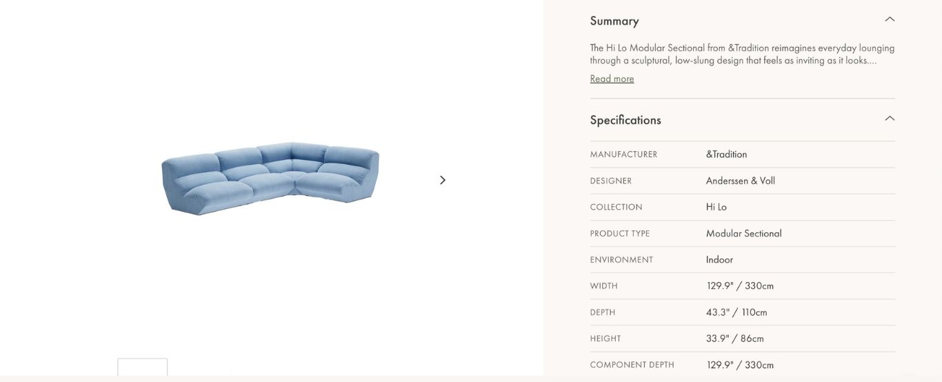
Bucketing the description, specifications, and materials into an accordion keeps the page visually clean without hiding information. Customers who want the full picture can access it in one tap. Those who don’t can move on without wading through content they didn’t ask for.
Showing only the first two lines of the product description by default creates a cleaner initial impression without removing the content. The read more allows interested customers to go deeper without making the page feel like a wall of text on arrival.
Specifications and materials were previously presented as unformatted text blocks, requiring careful reading to extract a single dimension or material composition. Converting them to clean table layouts made the information scannable in seconds rather than paragraphs.
Shipping timelines, design assistance, the trade program, and Lekker’s authentic design promise all existed somewhere on the site but weren’t surfaced at the point of purchase. The four branded info badges bring these directly into the PDP in a way that’s visually consistent with the redesigned page and easy to scan.
One of the most visible problems with the original PDP was inconsistency across products. The redesigned template established a single standard that applied to every product in the catalog, so the experience felt deliberate regardless of which page a customer landed on.
The result
The redesigned product page gives customers everything they need to make a purchase decision in the first viewport, and everything they might want to know one accordion panel away. The visual weight of the page shifted from information-dense to considered and calm, without removing a single piece of content.
The four info badges were developed collaboratively with the Sales and Marketing teams, who helped identify which purchase-decision signals mattered most to customers. Shipping timelines, design assistance, the trade program, and the authentic design promise all existed somewhere on the site — the redesign brought them into the product page itself for the first time.
What I learned
The most useful thing about how this project came together was that it started with observation. Bringing a well-researched case to the Sales, Buying, and Marketing teams made the collaboration easier: there was something concrete to react to, rather than a vague sense that the page could be better. The decisions that followed were stronger for having been tested against perspectives from outside my own.
It also reinforced how much template-level work matters in ecommerce. Individual product pages get attention. The template that shapes all of them rarely does. Getting the template right meant every product that came after it benefited automatically, without requiring individual attention each time.