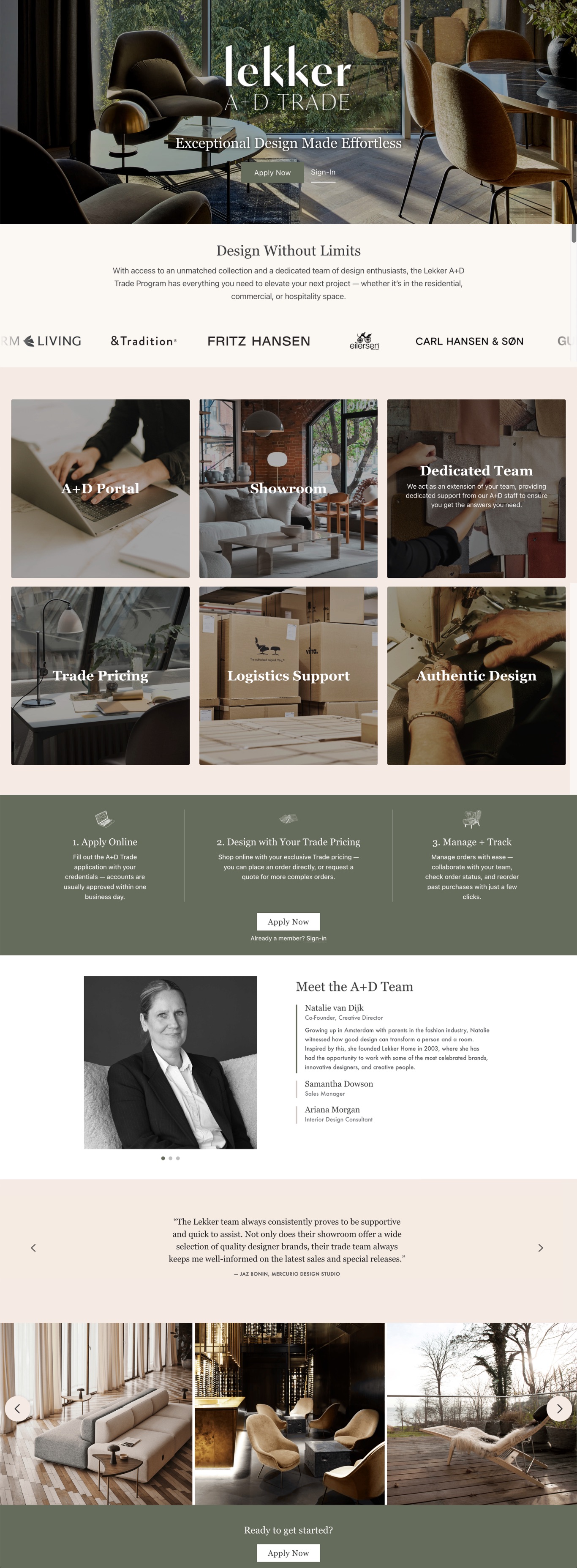
Montana Brand Landing Page
Montana is one of those brands that defies easy description. A Danish furniture maker rooted in Verner Panton’s legacy of color and modularity, Montana produces pieces that are as much a personal expression as they are functional storage. The collection spans storage, seating, office, bedroom, and dining in over 40 powder-coat colors, with nearly infinite configuration options.
The brief was to capture all of that on a single page. Show the range, convey the personality, and give customers a reason to engage with a brand whose full offering can’t be represented through a standard product grid alone.
My role
Montana’s product range is expansive and deeply color-driven, which made it an unusually good fit for an editorial landing page approach. The challenge was translating a brand known for its physical, tactile presence into something that read just as vividly on a screen.
Developed the editorial approach: leading with Montana’s personality and design DNA before introducing the product range. The page needed to make someone feel the brand before they started browsing, because the products make more sense once you understand what Montana is about.
Wrote all brand and collection copy, covering Montana’s Danish origins, its deep ties to Verner Panton’s color philosophy, the modular Free shelving system, and Lekker’s role as an authorized dealer with access to the full catalog. The voice had to match the brand’s playfulness without losing Lekker’s considered editorial tone.
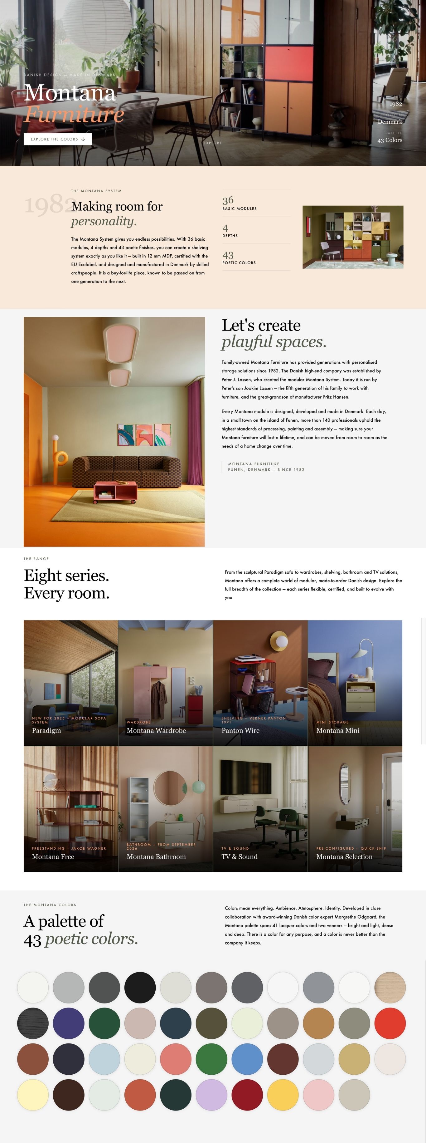
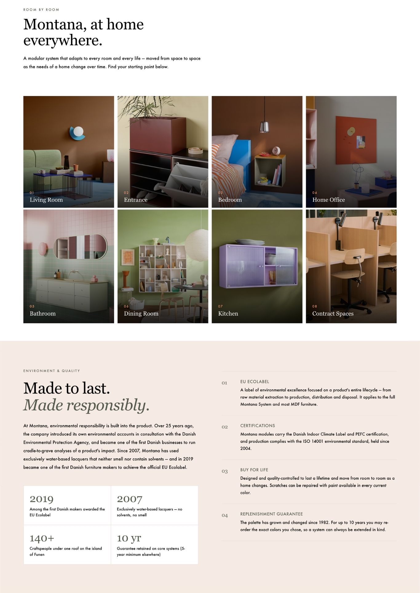
Designed and implemented the page in BigCommerce HTML. The layout moves through brand story, product category highlights, color philosophy, the modular system overview, and a direct inquiry CTA.
Selling color on a white background
Montana’s appeal is inherently visual and physical. Customers who encounter the brand in person respond to the depth of the powder-coat finishes, the solidity of the construction, the joy of choosing from 40-plus colors. None of that translates automatically to a webpage.
The page also had to serve two different kinds of customers: those who already knew Montana and wanted to see the full range in one place, and those who were encountering it for the first time and needed to understand what made it worth the investment.
Montana’s 40-plus powder-coat finishes are the heart of the brand experience. The page had to make color feel like a creative opportunity rather than a spec field, using imagery, copy, and layout to communicate what swatches on a screen can only gesture toward.
Montana’s catalog spans storage, seating, desks, TV benches, mirrors, and bedroom furniture across every room of the home. The page needed a structure that communicated that breadth without becoming a scroll marathon. Category groupings and editorial framing kept the scope legible.
Montana’s Free shelving system is defined by its configurability. A static page can’t replicate that experience, but it can communicate the possibility. The copy and image selection focused on showing completed, inspiring configurations rather than individual modules.
With no standard add-to-cart path available for most of the collection, the page had to move visitors from inspiration to direct contact. The CTA structure and copy were built to make reaching out feel like a natural next step, not a last resort.
Design decisions
The page opens with Montana’s story before touching a single product. Customers who understand the brand’s design heritage and color philosophy approach the product range differently than those who arrive cold. That context earns its place at the top.
Color was treated as the primary communication tool throughout. The products are shown, but the image selection and copy were built around making color feel like a creative decision rather than a spec detail — because for Montana, it is.
What I learned
Montana was one of the most enjoyable pages to write because the brand has a genuine personality. When a brand knows what it is, that clarity makes every editorial decision easier. The copy practically wrote itself once the angle was clear: this is furniture that takes color seriously, made by a company that has been doing exactly that since 1982.
It also reinforced how much editorial framing matters for a brand like Montana. Without it, a product grid of storage furniture in 40-plus colors is a lot of information. With the right context upfront, those same products feel like possibilities rather than options.